
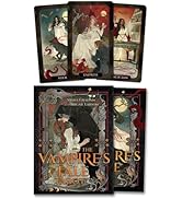
Golden Art Nouveau Tarot
Product ID: 110123336
Buy anything from 5,000+ international stores. One checkout price. No surprise fees. Join 2M+ shoppers on Desertcart.
Desertcart purchases this item on your behalf and handles shipping, customs, and support to Thailand.
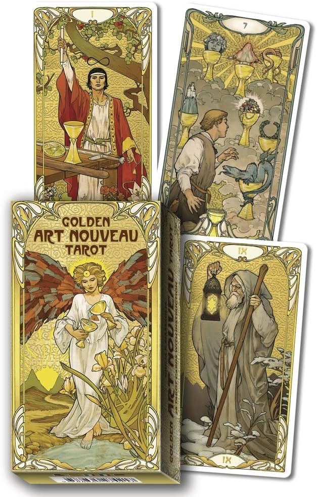
The gold-foil details of this outstanding deck perfectly complement the elegant designs and gracefully curved lines of the classic art nouveau style. Artist Giulia F. Massaglia captures the essence of the RWS symbolism and makes it truly sacred with her immaculate illustrations. Whether you're reading for yourself, for friends, or for clients, this deck provides all the insights and wisdom of a traditional tarot with the addition of a stunning visual presentation. These cards add a glorious touch of sparkle and shine to your tarot practice. Boxed deck (2¾ x 4¾) includes a 78-card gold-foil deck and instructional booklet. Review: A Beautiful Deck - This product arrived promptly and as expected with out issues. Arrived in a bubble mailer and undamaged. I was originally worried about the quality of the foil but the prints look fantastic against it and it doesn't seem cheap in the context of the artwork. It compliments the illustrations nicely and is not overly reflective while still maintaining that metallic finish. The images themselves are clean and crisp and hold the colors vibrantly. The card stock isn't as thick as some tarot cards, but it's nice and smooth as opposed to the textured look that playing cards can have. I think it'd have benefited from being a touch thicker, but is perfectly serviceable as is. Really the only thing that I have any issue with. The book it provides is in English, Italian, Spanish, French, and Portuguese. The descriptions of the cards are exactly that; more common descriptors of generalized events of the cards than direct translations of meaning, so a novice like myself will need a few supplemental sources to help learn meanings and intricacies. The box is guided in the same foil as the cards and is about the same quality as a regular deck of cards' box. The illustrations on it are of the same quality of the cards themselves and the text is thoughtfully placed to reduce visual noise and works well as a design and not just a hastily constructed sales pitch. Review: Stunning, expressive deck that is great both for beginners and seasoned readers - What a gorgeous deck this is! I love art nouveau, and had first tried the Mucha tarot but sadly that deck and I didn't quite jibe. So I was excited to see a new art nouveau Smith-Waite clone being published by Lo Scarabeo. The deck looks great in photos, but it's ten times more beautiful in person. The art is gorgeous and crisply drawn, the colors lush and rich, and the gold detail is stunning. Despite all this, my favorite part is how expressive the faces of the characters are. There is so much movement, emotion and passion in these cards. The deck is also an excellent and clear reader. It will work beautifully for anyone who wants to study the Smith-Waite tarot style but doesn't quite love the original art style. It's also an excellent deck for more advanced readers. There are a couple of downsides to the cards that it helps to be aware of before you buy. First, the card stock, while not the flimsy disaster of a stock that Llewelyn uses, is still on the thin side. I love thicker card stock, but I compromised here because the pros outweighed this particular con for me. Another big concern is representation and diversity. Simply put, there is none. The deck follows the original images of Smith-Waite, and that means no people of color, no body diversity, no diversity of ability, and strictly cis/hetero imagery. Depending on what you are looking for from your decks, this may be something to consider. Obviously it's ultimately a matter of personal choice whether or not you make this deck a part of your collection. The tuck box, while pretty, is quite flimsy and won't last for long; you will need to make alternative arrangements for keeping your cards safe and secure. And lastly, while this isn't really that important, one wishes that the deck had been edged in gold. However, at this price point it's something that is quite minor. I personally do plan on edging my deck soon. Overall, a stunning work of art and a deck that is both a great learning tool and an excellent reader. Highly recommended! EDIT: I edged my deck using the Tsukineko Brilliance Dew Drop ink pad in Galaxy Gold (sold here on desertcart and craft stores such as Michaels and Jo-Anns). The result is a lovely antique gold edge finish that looks gorgeous with the deck!


| Best Sellers Rank | #31,654 in Books ( See Top 100 in Books ) #47 in Tarot |
| Customer Reviews | 4.8 out of 5 stars 5,120 Reviews |
A**R
A Beautiful Deck
This product arrived promptly and as expected with out issues. Arrived in a bubble mailer and undamaged. I was originally worried about the quality of the foil but the prints look fantastic against it and it doesn't seem cheap in the context of the artwork. It compliments the illustrations nicely and is not overly reflective while still maintaining that metallic finish. The images themselves are clean and crisp and hold the colors vibrantly. The card stock isn't as thick as some tarot cards, but it's nice and smooth as opposed to the textured look that playing cards can have. I think it'd have benefited from being a touch thicker, but is perfectly serviceable as is. Really the only thing that I have any issue with. The book it provides is in English, Italian, Spanish, French, and Portuguese. The descriptions of the cards are exactly that; more common descriptors of generalized events of the cards than direct translations of meaning, so a novice like myself will need a few supplemental sources to help learn meanings and intricacies. The box is guided in the same foil as the cards and is about the same quality as a regular deck of cards' box. The illustrations on it are of the same quality of the cards themselves and the text is thoughtfully placed to reduce visual noise and works well as a design and not just a hastily constructed sales pitch.
P**U
Stunning, expressive deck that is great both for beginners and seasoned readers
What a gorgeous deck this is! I love art nouveau, and had first tried the Mucha tarot but sadly that deck and I didn't quite jibe. So I was excited to see a new art nouveau Smith-Waite clone being published by Lo Scarabeo. The deck looks great in photos, but it's ten times more beautiful in person. The art is gorgeous and crisply drawn, the colors lush and rich, and the gold detail is stunning. Despite all this, my favorite part is how expressive the faces of the characters are. There is so much movement, emotion and passion in these cards. The deck is also an excellent and clear reader. It will work beautifully for anyone who wants to study the Smith-Waite tarot style but doesn't quite love the original art style. It's also an excellent deck for more advanced readers. There are a couple of downsides to the cards that it helps to be aware of before you buy. First, the card stock, while not the flimsy disaster of a stock that Llewelyn uses, is still on the thin side. I love thicker card stock, but I compromised here because the pros outweighed this particular con for me. Another big concern is representation and diversity. Simply put, there is none. The deck follows the original images of Smith-Waite, and that means no people of color, no body diversity, no diversity of ability, and strictly cis/hetero imagery. Depending on what you are looking for from your decks, this may be something to consider. Obviously it's ultimately a matter of personal choice whether or not you make this deck a part of your collection. The tuck box, while pretty, is quite flimsy and won't last for long; you will need to make alternative arrangements for keeping your cards safe and secure. And lastly, while this isn't really that important, one wishes that the deck had been edged in gold. However, at this price point it's something that is quite minor. I personally do plan on edging my deck soon. Overall, a stunning work of art and a deck that is both a great learning tool and an excellent reader. Highly recommended! EDIT: I edged my deck using the Tsukineko Brilliance Dew Drop ink pad in Galaxy Gold (sold here on Amazon and craft stores such as Michaels and Jo-Anns). The result is a lovely antique gold edge finish that looks gorgeous with the deck!
C**S
An all-time favorite for me
I really, really love this deck. I'm a big fan of the traditional Rider Waite deck, and this is very close to that one, but the art absolutely pops out at you and just seems alive in a way. Some cards feel like you could reach into them, almost. The whole thing is very beautifully done. My only real complaint is they don't shuffle too well if it's been humid at all. And I sometimes have to take the time to wipe them all down after many uses because otherwise they stick while shuffling. A small price to pay though. This was my third deck, I now have over 15 and this is my most used one. If you like the RW, this is a great addition to your collection because the art is so similar but can be more impactful, IMO. For me, the symbolism of the cards, beyond their basic understood meaning tend to stand out more.
A**X
Gently Embossed
The box: Box comes wrapped in plastic. No dented corners. Has the same beautiful gold foil as advertised for the cards. Embossed with delicate pattern overlaying the gold. Inside the box: Cards inside are also wrapped in plastic. Comes with an info card about their website which you can use to expand your knowledge on tarot through this specific deck but... at a price? Seems this membership/subscription costs money though since the card comes with a coupon code. Also included; a pamphlet in English, Italian, Spanish, French, and Portuguese; that describes what is happening on each card and a single sentence about how to interpret its meaning. (Kind of useless in my opinion.) All cards were present plus an extra card that is a reprint of the front of the box. The cards: The gold on the cards is just as advertised and as beautiful as the box. Embossed as well. Cards fit nicely in my giant hands. Bigger than a “regular” playing card size but smaller than my past tarot cards. Artwork is impeccable and beautifully printed on both the front and back. Both sides come lightly laminated. Cards are made with a lightweight card stock. Nice for easy shuffling although I think it could be a liiiiiiiiiittle bit heavier. There is a slight white boarder around them which helps minimize any bent corners taking away from their beauty. Final thoughts: I’m so happy. 10/10
F**S
Beautiful deck!
Beautiful deck. Cards shuffle easily, and read well. The size is perfect for smaller hands, and I like that! I am a professional reader, and really enjoy the ease of these cards.
D**Y
A Very Special Deck -- Beautiful and Accessible
I have only had this deck a couple of days and have yet to do more than my two-card daily draw with it, but I can’t wait any longer to sing some praises. First off, Giulia Massaglia is an artist of incredible abilities combined with sensitivity for her subject. As it has shaken out for me through the decades of my involvement with the Tarot, I focus my actual workings with mostly RWS decks, or close derivatives. I tell you I am just nearly beyond words at what she’s pulled together here! All the tradition, the details, they’re all here but seen re-created with an entirely new view. This woman did an amazing thing, and I feel deep gratitude for her work. Then, I started to read the little book that accompanies the deck and found it more interesting than most of those, but it wasn’t until I turned the booklet over that I discovered the text had been written by Lunaea Weatherstone, fellow devotee of Brigid, and creator of two wonderful decks herself, Mystical Cats and Forest of Enchantment that I have. I was delighted all over again! I think Giulia and Lunaea should collaborate on a more detailed book to accompany this deck. It deserves it. I took longer than many to find this deck but find myself totally enchanted and feel it will be in my top three decks now and going forward.
C**R
Best Four-Star Deck I Have Seen
Tarot is art, but it is a particular kind of art intended to be experienced in a unique manner. The star rating system doesn’t always work with Tarot decks, and this is the case here. First, I was very pleased with the quality. Lo Scarabeo certainly has their “golden” technique down. I have never been disappointed with that. Here, the patterned gold is applied more or less, depending on the card. Sometimes, as in Temperance XVII it is just a filigree against a color background. Usually, the slightly textured design is gold-on-gold. The light hits these in such a way there is usually no difficulty seeing the intricate design. The varying use of gold among cards seems well chosen for the designs. Compared to, say, their Golden Marseille deck, the use of gold is much more restrained and less of a distraction. The artwork is top-notch, both faithful to the original Rider-Waite-Smith imagery while exhibiting the particular style and skill of the artist. Unlike so many decks that are ruined by a clunker or two, every single card catches the right note. The illustrations are more realistic than the storybook style of Pixie Smith, with many figures bearing distinctive “portrait-like” faces. There is a lot of feeling in each card, and the scenes are energetic where appropriate. I don’t have much to say about the cards individually because they are all, again, very well done, each a little masterpiece that still fits into the deck as a whole. The lack of multilingual card titles is most welcome. In fact, there are no titles at all. This should not pose a problem for anyone familiar with Tarot (or willing to make the minimal investment in getting to know her). As for being “Art Nouveau,” I think it’s close enough. The intricate Golden filigree recalls Oswald Wirth’s border design in a distant fashion. The sinuous border designs have the style, too. The illustrations themselves are not particularly Art Nouveau, other than the appropriately muted colors, but the deck does capture the flavor. In fact, it’s nicer than other Art Nouveau decks, surpassed only by the Golden Tarot of Oswald Wirth, the one with just the Trumps. NOT the complete “Wirth“ deck with those awful pips. (A new complete Wirth deck is due out in June 2021, with pips based on some “restored tetrad” theory. Unfortunately, for some reason none of the pip cards have been revealed as of writing, so we’ll just have to wait.) So, the sting is in the tail, as the saying goes. Why would I ding this gorgeous, faithful interpretation of The English Deck a star? It’s not because of the box. I don’t take stars off book reviews because I don’t like the dust jacket either. If you’re going to keep a deck for use, there are good reasons to get a new box for it. Sturdy custom telescoping boxes can be found for twenty bucks and custom wooden ones for twice that. (I prefer the former, though, with a silk-lined bag to prevent scuffs.) I also don’t take into account LBWs. They’re expected, and can be not too awful if that’s all you have, but I pitch them as soon as I open a new deck. The real answer can be seen in comparing this deck, the original RWS, and the Conver Ben-Dov Tarot de Marseille. It can also be seen in the picture of the Tower XVI on display in my Catch of the Day stand. Up close, appreciating the details of the Tower, it is indeed gorgeous. But in a spread, or on display, those very details can interfere with the peculiar art Tarot represents. The same could be said about many the cards in this deck. Add that lovely gold, and now a reading can become more difficult. Reading by the Table in typical English positional spreads (such as the famous Celtic Cross) probably isn’t going to pose much of a problem. But try reading by Image in a more open way (which is usually not done with the English Deck anyway) and it can get visually muddled. Interfere with flow. The second issue may be subjective, but the classic decks have a reason for depicting figures in a way that you probably would not recognize them if you passed them on the street. I find The Empress III, for example, a bit distracting. I would recognize her if I ran into her at the grocery store. Some cards are so portrait-like, they are in danger of losing that traditional archetypal quality that seems to me to have very sound reasons behind it. (Add the English tradition of forward-facing figures looking you in the eye and the issue is magnified.) Related is the careful anatomical detail of the nudes. Obviously, there is a long tradition of nudity: Le Diable XV is quite crude in the Tarot de Marseille. Nudity can be symbolic. And there is nothing prurient here. The illustrations are tasteful. Yet, when the Star XVII woman looks like a particular woman rendered as a detailed, naturalistic nude, I find that distracting for the same reason the very distinctive features of the Page of Wands, for example, are distracting. I prefer to be looking at “a” person, not “that particular” person, if you know what I mean. But you see that that a lot in decks. Maybe I’ll get used to it, because I do admire the deck very much. Neither of these two objections reflect badly on the deck or its artist. In fact, these are some of my very favorite illustrations from a non-reading perspective. If you, dear reader, disagree with my prejudices, please feel free to add an extra star to my review! In closing, this is a gorgeous deck with effective and tasteful application of “gold” with a decidedly Art Nouveau vibe. I am very happy to own it, and it is worth its own custom box in my collection. I particularly like how the artist has remained faithful to the original RWS artwork even while expressing it in her own, different style. I admire that sort of respect among artists, found so seldom these days.
R**S
Great, readable deck!
This is a really beautiful deck where the artist has put considerable effort into making images which are gorgeous to look at without compromising on the important details which make reading easier. So many artistic decks lack the density of pictoral information, which requires you to rely more on memorized card meanings. These cards include nearly all the details you'd get in a traditional Rider-Waite deck, with much more attractive art. As such they're well suited for beginners or advanced readers. The card stock is a little thin, and a nicer box would do more to protect the cards. (You'll probably want something better to carry them in than the tuck box these come with). They do shuffle easier, though, and while I treat them gently they don't strike me as particularly fragile, even if they're definitely thinner than some of my other decks. I really like this deck and find it exceptionally easy to read with, as well as gorgeous to look at.
J**T
Beautiful, sturdy, well printed
The cards are beautiful, the picture just doesn't do it justice. The gold is so shimmery. They feel sturdy. There is a small guide book, but it doesn't really tell you the meaning, it's more like a description of the card. I'm very happy with it.
J**T
Love this deck!
Really happy that I reordered for this deck. I wanted a deck that closely followed the style of the RWS, and I found this gem! Originally I received a used one but I was able to return it easily. This came in brand spanking new. This was received in a plastic package. And the deck itself was wrapped up as well! Quality is really nice. The artwork is beautiful. Shuffling is 👌🏼👌🏼👌🏼and the cards glide together nicely. If you small hands, its comfortable to use! I would buy this again just if my current gets worn out for usage!
A**N
Vale a pena cada centavo
Esse deck é muito bonito e impressionante. Pessoalmente, ele é ainda mais bonito do que nas fotos — extremamente brilhoso e com um visual que realmente chama atenção. Sobre o tamanho: ele não é um deck grande. Para quem procura cartas maiores, talvez não seja o ideal. Mas, para mim, o tamanho foi perfeito, pois ele encaixa muito bem nas mãos e é ótimo para embaralhar. As cartas deslizam muito bem durante a tiragem. O material lembra bastante o de cartas de baralho tradicional, o que torna o manuseio fácil e confortável. Em relação à espessura, as cartas são finas e bem maleáveis. Então, se você prefere cartas mais duras e firmes, talvez não seja a melhor opção. Mas, se gosta de cartas flexíveis, você vai curtir. No geral, valeu muito a pena a compra. Não me arrependi e recomendo, principalmente pela beleza e pelo brilho do deck. Comprei a versão do tamanho normal, padrão, da Editora Llewellyn Publications, paguei R$190,95. Chegou antes do prazo. Fiquem atentos para não cairem em golpes. Quando o deck chegou na alfândega, recebi uma mensagem no WhatsApp informando que o deck estava detido na alfândega e precisava pagar uma taxa de importação para liberar, porém essa mensagem é golpe. No momento da compra já está incluso os impostos e taxas da importação.
C**N
Très beau jeu. Belle illustration.
J'aime beaucoup, ce tarot rider waite Smith, bien dessiné, avec le côté art nouveau, il est très beau. Pour ceux et celles qui veulent apprendre le tarot, n'hésitez surtout pas ! Un magnifique tarot pour nous éclairer sur notre chemin, pour faire le point sur sa vie à l’instant T, pour nous orienter sur nos choix de demain.
E**R
Highly recommend - it's a favorite!
This is an authentic publisher deck by Lo Scarabeo. The cardstock shuffles like a dream, it has a lovely rose pedal finish (it's not matte and it's not gloss), the pictures are stunningly redone while still capturing the essence of RWS artwork and the colours are vivid. The gold folks on the cards just gives it an even more luxurious feel... it's just a beautiful classic for anyone's collection. This deck is a favourite of mine and I know of many others, and the quality is a likely reason why. It's just lovely to work with. Highly recommend it!
Trustpilot
2 weeks ago
2 weeks ago