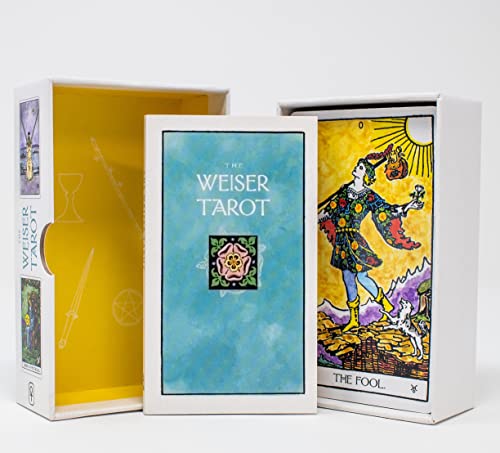


The Weiser Tarot: A New Edition of the Classic 1909 Waite-Smith Deck (78-Card Deck with 64-Page Guidebook) (The Weiser Tarot Collection) [Waite, Arthur Edward, Smith, Pamela Colman, The Editors of Weiser Books] on desertcart.com. *FREE* shipping on qualifying offers. The Weiser Tarot: A New Edition of the Classic 1909 Waite-Smith Deck (78-Card Deck with 64-Page Guidebook) (The Weiser Tarot Collection) Review: What I like, what I don't... - Just got this deck and am still getting to know it, but so far this is what I love: a dreamy palette of saturated tones, faithfulness to the original RWS depictions, the added diversity of skin colors & the backs complement the deck style. What I'm not as happy with is the "stickyness" of the cards -- they're not as easy to shuffle as other decks I have, tho that may change with use over time. I also feel that details are sort blurred as if out of focus, so for a beginner that might make it harder to interpret. I wanted a more multicultural deck to use with clients and this fits the bill, plus it was on holiday sale so I'm happy. Review: This is what I’ve been looking for. - Why did it take so long for at least one tarot company to create an ALL INCLUSIVE RWS tarot deck? As soon as I saw this deck, I knew I was going to preorder it. And I did. And I just got. And I freaking love it! There are details in the deck that I never noticed before in the RWS that this deck somehow emphasized for me. This is your classic RWS with a twist. I love the different skin tones so much. The lack of this in other classic decks is what has really bothered me since I started learning tarot. Each card looks painted with water colors, which I don’t mind actually. The card stock seems okay but I haven’t used the cards yet. It’s not too thin and has a matte feel to it. I think the cards will hold up for a while, but I’ll have to use them to know for sure. The book that comes with it is thick and seems to have a lot of thought put into it. Im very excited to start using The Weiser Tarot and learning more about it’s own unique energy and personality.


| Best Sellers Rank | #80,674 in Books ( See Top 100 in Books ) #74 in Fortune Telling #206 in Tarot #1,877 in Personal Transformation Self-Help |
| Customer Reviews | 4.6 4.6 out of 5 stars (280) |
| Dimensions | 5.31 x 1.65 x 3.27 inches |
| Edition | New |
| ISBN-10 | 1578637953 |
| ISBN-13 | 978-1578637959 |
| Item Weight | 12.3 ounces |
| Language | English |
| Print length | 64 pages |
| Publication date | September 14, 2022 |
| Publisher | Weiser Books |
M**R
What I like, what I don't...
Just got this deck and am still getting to know it, but so far this is what I love: a dreamy palette of saturated tones, faithfulness to the original RWS depictions, the added diversity of skin colors & the backs complement the deck style. What I'm not as happy with is the "stickyness" of the cards -- they're not as easy to shuffle as other decks I have, tho that may change with use over time. I also feel that details are sort blurred as if out of focus, so for a beginner that might make it harder to interpret. I wanted a more multicultural deck to use with clients and this fits the bill, plus it was on holiday sale so I'm happy.
M**A
This is what I’ve been looking for.
Why did it take so long for at least one tarot company to create an ALL INCLUSIVE RWS tarot deck? As soon as I saw this deck, I knew I was going to preorder it. And I did. And I just got. And I freaking love it! There are details in the deck that I never noticed before in the RWS that this deck somehow emphasized for me. This is your classic RWS with a twist. I love the different skin tones so much. The lack of this in other classic decks is what has really bothered me since I started learning tarot. Each card looks painted with water colors, which I don’t mind actually. The card stock seems okay but I haven’t used the cards yet. It’s not too thin and has a matte feel to it. I think the cards will hold up for a while, but I’ll have to use them to know for sure. The book that comes with it is thick and seems to have a lot of thought put into it. Im very excited to start using The Weiser Tarot and learning more about it’s own unique energy and personality.
E**R
Beautiful and classic
I absolutely love this deck, I love the feel of the cards, the card stock, the beautiful color palette used, and I use it all the time! It has become my workhorse deck. I love the fact that it is RWS, but reimagined because the colors in the original RWS are pretty off putting! This is a Wonderful release on the eyes, wow still being true and faithful to the RWS! Yay!
M**E
A yes deck!
This is my new go to tarot deck. Vibrant colors, nice card quality, good energy. I use this deck a lot on my social media platforms. I have purchased many decks through the years. This one is one of my go to decks and stays on my desk at all times. It’s a great tarot deck.
R**A
Absolutely love
I am so thrilled with this deck. The images we all know and love, presented in vibrant and inclusive colors. Could not ask for more. I like the matte card stock since there is no glare on the cards, although it is stiffer and does not appear to be as resilient as the thinner blue core card stock.
F**N
Vivid watercolor look to RWS tarot imagery
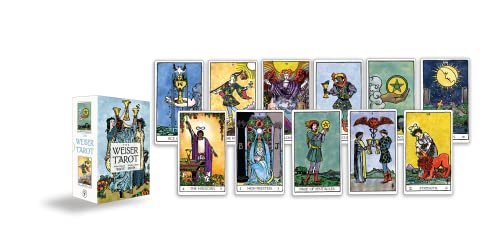
I have many variations of Rider-Waite-Smith (RWS) decks in my collection that take Pamela Colman Smith's original artwork and just present it in a slightly modified way (i.e. foiled backgrounds, black line-art only on a parchment colored background, etc.). This deck appealed to me because it has a watercolor look, one of my favorite art styles. Overall I'm happy with the deck! For the price paid, I feel it's a good value. The two-piece box is hard cardboard and protects the cards well. The cards themselves are a medium weight thickness with a white border, and a finish that's a combination of matte and glossy. They overhand shuffle well - I don't generally riffle shuffle my cardboard decks to avoid bending them. The back sides are light blue with the rose design in the center and ankhs around the top and bottom. The guidebook is pretty standard. I usually flip through them but don't reference them often. This one has a helpful "suggested reading" section at the back. As for the watercoloring of the images...an effort was made to change the skin tone of the human characters to be more diverse and inclusive. It's a good step forward while still using the original artwork, as compared to more modern decks where the people are newly drawn to represent more ethnic groups, abilities, body types, etc. The backgrounds, clothing, and symbols are watercolored successfully for the most part. Instead of flat colors, they have a blotchy, textured look that adds depth to the scenes. I like the effect this gives, even when it looks like they were painted "out of the lines." It's a soft blending of colors and in some cases adds a bit of a "glow" around lights (like the stars and lanterns). I've included a few pictures that illustrate where the watercoloring works well and some where it doesn't. For example: 1) The 8 of Cups, Ace of Cups and the Fool - the reds and yellows really pop and the skies are moody and rich. The moon has a slight aura around it that I really enjoy. 2) The Hermit, the Star, and the Five of Wands are also particularly well done, in my opinion. The Hermit conveys a look of solitude, and the stars on the next card seem to sparkle. The different colored frocks on the Five of Wands make this image vivid and lively. 3) On the flip side, the Ten and King of Pentacles and the Hierophant are too muddy. The images just bleed into each other - there's too much going on and not enough contrast or brightness to make these images work for me. 4) Another odd feature found on some cards, like the Two, Page and Seven of Pentacles, is that the predominant color looks like it's just washed over the whole image. The face of the man on the Two card looks too green. The clothing and background are both a dark gray on the Page card - although at least his face is light enough to stand out. These are just my thoughts and opinions - you may like or dislike this style based on your own preferences. But I'm happy with this deck. I see myself using them frequently, compared to some decks I buy because I like the theme (such as an animal deck or collage style cards) which I enjoy as just a card-sized art collection.
J**D
Professional tarot reader
Moved across the country had to leave all my decks home. I picked one to buy and choose this deck for a second round. Love this deck!
L**A
Beautiful Cards
Beautiful cards. The colors are vibrant and they feel good in my hands. I don’t bend my cards when I shuffle like l’m about to play rummy with a deck of 52 cards. So I don’t have bending issues with these, or any other tarot cards for that matter. But these are great for readings and I definitely recommend
C**N
Très beau tarot
M**J
Love this card stock, shuffles like a dream
S**E
Ein unglaublich schönes Deck! Ich liebe die Farben, wie mit Wasserfarben gemalt. Es macht bei jeder Legung Freude.
K**A
The cards are really of good quality, crispy and attractive. I felt power, and very positive holding while working with these cards. Don't forget to use powder for a while as it sticks and sometimes.
S**Y
I mainly use Rider Waite and I have to retire some decks from time to time so I like to get different versions of rider Waite as I like to have 3 RW decks that I have connected to in my circulation at any given time. This one called me I didn’t get it at first but it was one that I had in my mind and I’m glad I bought it. The colours are beautiful. The card stock is what makes it for me, it’s not the usual glossy. It’s great quality card stock that’s really easy and effortless to riffle shuffle . I connected really good with this deck.
Trustpilot
1 month ago
1 month ago